You’ve got traffic. People are clicking your ads. They land on the page. They scroll. They read.
And then they leave.
No sign-up. No registration. Just a polite little bounce and they’re gone forever.
Your first instinct is to blame the ad. Wrong targeting, maybe? Bad creative? Time for new copy?
Here’s the thing: nine times out of ten, the ad is fine. The landing page is the culprit. And not in the way most people think. It’s not your colours, your layout, or your font choices. It’s the psychological sequence – the order in which you’re presenting information.
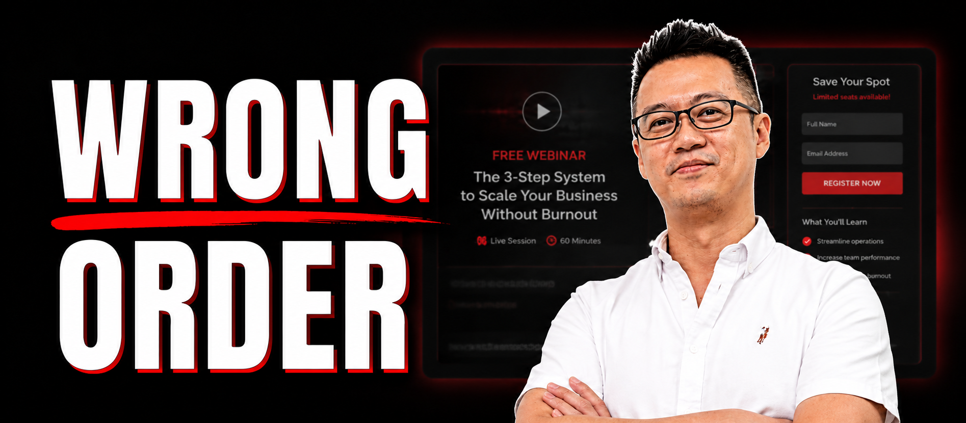
Most webinar registration pages are written completely backwards. And the fix doesn’t require a redesign. It’s just copy.
This post breaks down the exact framework behind over 2 million webinar sign-ups – the three-layer headline stack, the bullet formula, and the three supporting elements that turn a page that “looks fine” into one that actually gets people in the room.
Watch here:
Listen here:
Why "Logical" Copy Order Is Silently Killing Your Sign-Ups
“It’s like proposing marriage before saying hello. Yeah, you’ve got the ring – but the timing is way off.”
Picture this. You spend weeks building a webinar. You know your topic inside out. You know why it matters. You know exactly who it’s for and what they’ll get out of it.
So you sit down and write the registration page the way any reasonable human being would. You start by naming what the webinar is about. Then you explain the solution. Then you list the benefits of attending. Then somewhere near the bottom, you mention who it’s actually for.
Makes perfect sense to you. You care deeply about this topic. You know why it matters.
The problem is your reader doesn’t care yet.
Here’s a truth most marketers learn the hard way: people don’t make decisions logically and then justify them emotionally. It works the other way around. They feel something first. Then the brain finds a reason to act.
So if your page leads with the solution before you’ve shown that you understand their situation – if you’re explaining HOW before they care about WHY – you’ve lost them before you’ve had a chance. They read the page, nod politely, and close the tab. Not because your webinar topic is bad. Because you haven’t given them a reason to feel anything yet.
The good news? This is completely fixable without touching a single design element. It’s a copy problem, and copy problems have copy solutions.
The lesson? Lead with emotion, follow with logic. Your reader needs to feel understood before they’ll care about what you’re offering.
Layer 1: The Pre-Headline (Make the Right Person Feel Seen Before They've Read a Word)
“The shortest line on your page does the heaviest lifting.”
The pre-headline is one sentence. It’s the smallest element on the page. And most coaches either skip it entirely or waste it on something generic like “Free Webinar” or “Join Us Live.”
That’s a missed opportunity. A big one.
The pre-headline has one job: make the right person feel seen the moment they land on the page. Before they’ve read your main headline. Before they know anything about your webinar. Just – seen.
It does this by naming two things in quick succession. First, the avatar. Who exactly is this for? Second, the pain. What’s going wrong for them right now?
Something like: “For founders who want to work less hours each week.”
That’s it. Short. Specific. Pointed directly at one person.
The right reader lands on the page, reads that line, and thinks: “That’s me.” And just like that, you’ve got their attention. Not because you dazzled them – because you demonstrated that you understand them.
This is the difference between a page that feels like a billboard and a page that feels like someone’s talking directly to you.
The lesson? Your pre-headline isn’t a label for the page. It’s a mirror. The right person should see themselves in it immediately.
Layer 2: The Main Headline and the Polarity Effect
“Your main headline needs to do two things at the same time: show what’s possible and name what’s been blocking them.”
This is where most coaches lose people. And it’s not because they write badly. It’s because they write the wrong thing.
The most common mistake? Writing the name of the webinar as the headline.
“The Productivity Mastery Webinar” tells someone what the webinar is called. It tells them nothing about why they should register. It’s the copywriting equivalent of a nametag.
Your main headline needs to pull the reader in emotionally. The way to do that is what’s called the Polarity Effect: you put desire and validated frustration in the same line.
Desire is the outcome they want. The “after” state. The life that looks better than the one they’re currently living.
Validated frustration is the challenge they’ve already tried to overcome and failed at. The approach that never quite worked. The thing that makes them feel like the answer is just out of reach.
Put those two things in one sentence and you’ve got a reader who feels seen AND hopeful at the same time.
Here’s an example from the transcript: “How to have a self-managing business that scales – without hiring an expensive COO and documenting every little thing.”
The desire? A self-managing business that grows without you doing everything.
The frustration? Having already tried the COO route, or spending hours writing processes and checklists that nobody follows. (They’re collecting digital dust in a folder somewhere. We’ve all been there.)
When you put these two things together, the reader doesn’t just understand your offer – they feel it. That’s when they’re ready to hear the how.
One important thing to keep in mind if you’re running this page with paid traffic: be careful with how you name the frustration. Meta’s ad policies can flag certain direct pain-point language, especially anything that sounds like it’s calling out a personal characteristic or implying a negative attribute. If you need to navigate around that, flip it – speak to the desire instead. Someone who has the pain will still connect with the desire. You just need to be a little more careful with the phrasing.
The lesson? Don’t tell them what the webinar is. Tell them what they want and what’s been stopping them from getting it. Those are two different things entirely.
Layer 3: The Extended Headline (Now Logic Gets to Show Up)
“You don’t earn the right to talk about how something works until they care about what it delivers.”
So you’ve made them feel seen with the pre-headline. You’ve made them feel desire and frustration with the main headline. Now – and only now – you’ve earned the right to introduce your solution.
This is where the extended headline comes in.
At this point, the reader has emotional buy-in. They’re nodding. They’re thinking, “Yeah, I want that.” Now their brain is asking: okay, so what’s the answer?
The extended headline delivers two things: your unique mechanism (the specific approach, method, or system you use), and the tangible benefits of that approach.
Something like: “In this free training, discover my three-step GrowOS system powered by AI that clones your decision-making process.”
Notice what’s happening there. You’re not explaining HOW the system works. You’re naming it, and you’re hinting at what it does. That’s intentional. The curiosity gap is the whole point. They need to attend to find out the rest.
The sequence across all three layers is: emotion first, logic last. Pre-headline makes them feel seen. Main headline creates pull. Extended headline teases the mechanism without giving the game away.
Get this right, and the rest of the page is significantly easier to write. The heavy lifting is done. The reader is already half sold.
The lesson? Name your mechanism. Don’t explain it. Save the explanation for the webinar itself – that’s what they’re registering for.
The Bullet Formula: Create the Itch, Save the Scratch
“If someone reads your bullet and thinks ‘I’ll just do that myself’ – you’ve just given them a reason not to register.”
Most bullet points on webinar registration pages have the same problem: they’re too generous.
Coaches pour everything they know into the bullet section. They explain the strategy. They describe the approach. They lay out the steps.
And the reader thinks, “Oh, I get it. I’ll just go do that.” Click. Gone.
Your bullets don’t close the sale. Your webinar does. The bullet’s only job is to make the person think, “I need to be on this call.”
Here’s how to do it. Lead with the outcome – what will they get? Add something that makes it surprising or achievable. Then tease the mechanism name without explaining how it works.
Weak version: “Learn how to use email follow-up sequences to recover no-shows after your webinar.”
Problem: you just explained the solution. They’ll ask ChatGPT to write it for them and never register.
Strong version: “How to generate sales from people who miss your webinar using the three-step long-tail follow-up system.”
The outcome is clear. The mechanism is named. The how is saved for the webinar.
One more thing: the intro line before your bullets matters more than most people realise. “At this webinar, you discover” frames what follows as insider knowledge. “Topics covered” frames it as a table of contents. These are not the same thing. One builds intrigue. The other reads like a corporate agenda.
The lesson? Bullets create the itch. The webinar scratches it. Never let the bullet do the webinar’s job.
The Three Supporting Elements Most Coaches Get Wrong
Social Proof: Specific Beats General. Every Time.
Not all social proof is equal. And where you put it and what kind you use actually matters.
“This training changed my business” is vague. It could mean anything. It convinces almost nobody.
“326% more conversions from one headline change” is specific. It paints a picture. It’s the kind of number that stops a reader mid-scroll.
Specific results outperform vague testimonials every time. If you’ve got numbers, use them. If you’ve got specific outcomes from past attendees, lead with those. Ditch the warm-and-fuzzy quotes that don’t tell the reader anything concrete.
One word of caution: if your results involve financial figures, check the ad platform policies before putting them on a landing page running paid traffic. Platforms like Meta can flag financial promises, even when they’re real. Frame results carefully.
Urgency: Just Tell the Truth
This one is simple. Use a countdown timer to the next live event. The date is fixed. The clock is real. That’s all the urgency you need.
No fake “only 47 spots left” tactics. No manufactured scarcity. No arbitrary deadlines that reset the moment you reload the page. Real urgency works because it’s true – and readers can smell the fake version from a mile away.
The Bio: Stop Writing a LinkedIn Profile
The bio section is where a surprising number of coaches throw away their credibility by trying too hard to look credible.
Years of experience. Master’s degree. Featured in Forbes. Worked with executives, entrepreneurs, and high performers.
That tells me what you are. It doesn’t tell me you understand what I’m dealing with.
Here’s the one question every reader is silently asking when they read your bio: “Why should I trust this person to solve my specific problem?”
Certifications don’t answer that. A story does.
A strong bio opens from frustration with the problem. It shows you’ve been in the trenches with it. Then it closes with a specific proof point that answers the real question in the reader’s head: “Has this worked for people like me?”
Weak bio: “Sarah Johnson is a certified life coach with 15 years of experience. She has a master’s in psychology and has been featured in Forbes.”
Stronger bio: “Sarah spent eight years watching high performers burn out – and three more years figuring out why the standard advice wasn’t working. What she found became the framework behind this training. She has since helped 400+ founders reclaim 10 hours or more per week without sacrificing results.”
See the difference? One is a CV. The other is a story that builds trust.
Does the Formula Have to Be Followed Word for Word?
Short answer: no.
The real-world example from Radical Marketing’s own client work proves this. The page didn’t follow the three-layer stack in the exact order described above – the extended headline element appeared where the main headline should have been, and the frustration component was left out entirely (because Meta’s policies made direct pain-point language too risky for that particular campaign).
The result? A 50% lift in conversion rate. From 14-15% to 23% on cold traffic.
The point isn’t to follow the formula like a script. It’s to understand why each element exists and what job it does. Get the psychological principles in place – emotion before logic, desire before mechanism, tease before explain – and the page will work even if the exact order shifts.
The formula is a map, not a set of handcuffs.
Put It All Together
So here’s the full picture.
Most webinar registration pages fail not because the webinar is bad, but because the copy is in the wrong order. They lead with logic when they should lead with emotion. They explain the solution before the reader has any reason to care about it.
The three-layer headline stack fixes that sequence. The pre-headline makes the right person feel seen. The main headline creates desire and validates frustration at the same time. The extended headline teases the mechanism and rewards the reader’s attention with a taste of what they’ll learn.
Add bullets that create intrigue without giving away the content, social proof that’s specific enough to be believable, real urgency, and a bio that earns trust through story rather than credentials – and you’ve got a page that converts.
Most of the time, the fix doesn’t require a single design change. It’s the copy sequence.
Ready to see what a properly structured webinar funnel looks like for your business?
At Radical Marketing, we build and manage the whole system – from ads to registration pages to follow-up sequences – for coaches and experts running high-ticket programs.
If you want to know whether your current webinar page is costing you sign-ups, and what to do about it, let’s talk.